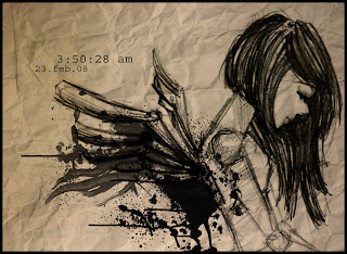
hv no idea with my batik sketch...n couldn't sleep.... arh.... end up....draw ppl ba.... aiyaiyai....already long time din draw human...feel so strange a.... heeeee.....
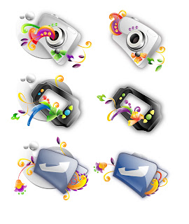
1)can u recognize all the icons above as wat it stands for? 2)which one is not clear? 3)do they look consistence? 4)any problem with da color? * suggestions or comment?? ur comment is welcome* thx~ xie xie x 1000000000
my theme for icon design is batik, bt ...hehehe.... doesn't seems really tat ''batik''... :p...again..thx for helping ~
i only manage to post 3 of my vektor icon T.T .. the right side is after simplification.... wat u guys think bout my icon? which one more suitable as icon?any suggestions on refining?leave me a comment~~ 10 Q~~~ x 1000000000