Again...my mind blank ....blablabla...i hv forgotten to say anything about my posters! arh arh arh ~! bt biasa d la.... still inside lab nw.... heheheee... dun care dun care...(i can't care oso ba...)....so i will explain here.... ( if u guys couldn't understand, sorry for my poor eng la...hehehe) actually i was inspired by the lil cute yellow sponge square pants, remember thr's one series whr sponge bob with patrick sit inside an empty box and started to imagine...haha...they was so hapi inside an empty box!just a box with nothing!....then only i realize actually sometime ''nothing'' is tat wonderful..i had look down on nothing since i was born...O..O i really belif we need space, an empty space with nothing inside.....many things people lack of...'nothing' is one of them...heehee...let's c the power of ''nothing''~
here, my first poster :

this is for shu uemura cosmetic... hehee
slogan : nothing, is wonderful
great imagination always starts from nothing.
tis is a gal standing in an empty area, surrounded by nothing and started to imagine. the interesting part is wat 'coming out' from her brain, it was her imagination. without any interruption a person might hv a better imagination. as we knw, make-up is part of art, need creativity, creativity comes from imagination. thus, i hv choosen shu uemura as the company for tis poster. the color inside the biggest bubble, it's powder.
beeeeecos :

ya....for the shu uemura eyeshadow set.
n another 2nd media :

shu uemura make-up box.
:D
my second poster:
nothing, is wonderful
with empty mind comes the peaceful mind

same slogan...heheee
create a heavy feelin on the left side, the scene where normally we can c in the city. it is breathless, everyone, everything is working like a machine and ''nothing'' is wat people wish at this very stress moment. they need a simple space without all the things'' . just tat simple. yet tat hard. haha....
the chosen company is vanilla splits. beautifully restored 60's vw microbus available to rent from them.... +44(0) 1243 545 725 ... call nw! :p it's not in m'sia la... T..T
these vw microbus definitely can help us to escape from the stress~
2nd media :

3rd poster :
nothing, is wonderful
0, where every wonderful journey starts.

why 0 ? hmmm...normally people will assume '0'= nothing (except when comes to money) i mean the 0 alone la...for me, actually i c '0' as a hole, ya...it's nothing.... bt i can c the moment where all the ''wonderful stuff'' comin out from tat '0'(bcos it's nothing,possible for me to c any beautiful stuff rushin out)heehee...positive thinker~. remember '0' is the starting point for all~ dun u think it's nice? heheee.... (use ur imagination ba)
i choose quaker oat for tis poster bcos they produce healthy breakfast cereal. A day will be great with a good start~ ( everyday a new day...)
2nd media :

mt last poster :
nothing, is wonderful
black hole, nothing being known but actually there is something.

in the point of view of normal people, the most powerful thing in the universe is 'nothing', just an extremely dark area. inside the 'nothing', thr's a great dark force that can absorb everything in the universe including the light! isn't tat awesome? although black hole sucks everything, bt it still looks like nothing from the outside. human still dun hv the ability to find out wat's inside the 'nothing'. so, i imagine myself lu~hehehee....
i choose nasa...very simple..bcos of nasa only we knw the existence of black hole. :)
here goes my 2nd media :


and lastly.....
special thx to :

wow~ in big action, to inspire others ? perhaps...
hehee....
*comments r welcome*
:)


 this is for shu uemura cosmetic... hehee
 ya....for the shu uemura eyeshadow set.
 same slogan...heheee


 in the point of view of normal people, the most powerful thing in the universe is 'nothing', just an extremely dark area. inside the 'nothing', thr's a great dark force that can absorb everything in the universe including the light! isn't tat awesome? although black hole sucks everything, bt it still looks like nothing from the outside. human still dun hv the ability to find out wat's inside the 'nothing'. so, i imagine myself lu~hehehee....

 wow~ in big action, to inspire others ? perhaps...


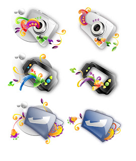
 i only manage to post 3 of my vektor icon T.T .. the right side is after simplification....